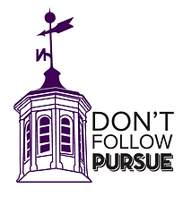
TRUMAN STATE BRANDING
Redesigning the Truman State University brand was an intriguing project which enabled me to challenge myself both in my hand-skills and conceptual thinking abilities. In approaching this project I aimed to challenge the university to expand its approach when recruiting prospective students. Previous branding campaigns for Truman have focused on an exuberant amount of purple and cliche images of students smiling on the quad and images of books or students studying. A central focus of this campaign was to empower Truman State to stand out compared to other universities through the utilization of good design and engaging illustrations.
Below is a unique take on the folder that would be given to students when they they visit the campus. The front flap serves as a rather interpretive map of the campus showcasing the buildings throughout the university. While the left inside flap has many quick facts regarding the university and campus activities.


The two poster designs below focus on different buildings on campus that can be tied to the "Pursue" tagline of the university. By portraying two of the most famous structures on campus in an eye catching illustrative layout emphasizes the idea that while Truman has a proud history it is also a school that is not afraid to do things differently. Both of these posters also serve as attention getting artworks that intrigue viewers to look closer to absorb the details.


Additionally I created an informational booklet that could be handed out or mailed to prospective students. This booklet itself slides into the "Don't Follow" case and the die cut reveals the graphics on the cover pulled from the designs of other pieces. This small booklet contains quick facts about the university laid out in an easy to navigate fashion utilizing images and graphics.


Postcards which could be mailed to prospective students are featured above. These incorporate actual images from campus overplayed with one of the featured colors so as to stand out in a pile of white mail. Meant to imitate an old fashioned postcard, the front features the name "Truman" with a quick phrase focused on its superior academics, the university's the main selling point. Illustrations of the buildings are on the back typing these designs to the welcome folder potential students receive when visiting the school.


The redesign of the three informational sheets below would be included in the folder prospective students would receive when visiting campus. In addition the two illustrations are designs that could be put on stickers or buttons as giveaway as well.